

How to choose the color of the kitchen?
Starting another repair in the kitchen, the natural question arises - how to choose the color of the kitchen? During the Soviet Union, people were very limited in their choice of furniture, wallpaper, flooring and other materials. Therefore, going to visit friends, we saw a monotonous typical interior. Whether business now! Eyes run up from the abundance of materials for repairs and kitchen sets. So now we are preoccupied with the problem of choosing the most successful option for our future cuisine. Our article will tell you what important points you need to consider when thinking over the upcoming repair.
to contents ↑How to choose a color for the kitchen? What should be considered first?
The kitchen is one of the most visited places in the apartment. Someone devotes a lot of time to cooking, someone appreciates friendly family dinners, and someone just likes to sit in the cozy kitchen for a long time in the evening and read a book with a cup of tea in his hands. Based on this, the choice of the color scheme of the kitchen interior should be approached wisely, thinking through everything to the smallest detail:
- It is important to understand that the size of the kitchen is what you need to build on when choosing a color scheme. It is well known that light colors will increase the available space, and dark colors - on the contrary, “eat” it. Accordingly - if the kitchen is small in area, then it is advisable to use light shades, adding gloss, glass, and mirror surfaces for a greater effect.
- Next, consider the illumination of the room. If the kitchen window faces east or south and there is plenty of sunlight, then you can very well choose cool colors or add black, chocolate or blue for contrast. But when the windows face north or west, or are simply obscured by trees, by the neighboring building, it is advisable to use warm colors and additional lighting.
- Do not rush to focus only on fashion trends. To successfully choose the color of the kitchen, you need to consider the psychotype of those people who live in the house and will spend a lot of time in the kitchen. Brightness does not frighten young and energetic people, but people aged or those who suffer from mood swings just get tired at work, dark colors, contrasts and catchy shades are contraindicated. Therefore, gather all family members and choose the best option that will appeal to everyone.
- It is also necessary to take into account the presence of small children and animals in the house, due to the presence of which the dirt in the kitchen will be without fail. When choosing countertops and facades of the lower tier of a kitchen set, pay attention to whether dirt and stains on their surface will be strongly visible. All housewives try to maintain cleanliness in the kitchen, but when every fingerprint is striking on furniture and tables, an hourly cleaning will be a real punishment.
- When choosing a color scheme, do not forget to think about the floor. If you are going to change only kitchen furniture and walls, and do not touch the flooring, then think everything in such a way that the color of the tile, laminate, linoleum or other coating does not stand out from the general idea.
How to choose the color of the kitchen? - Design Tips
After you have taken into account all the main points when choosing the color scheme of the kitchen, you should pay attention to the subtleties that designers share with us:
- Even if you have a large kitchen, do not mix more than 2 colors in it.In this case, one color should be dominant (in small or dark kitchens - light, in large and light - any), and the second - complementary.
Important! The third color can only be present in individual elements - accents designed to be a “bright spot." It can be both contrasting colors and shades of the same color.
- If your kitchen is small, then it is advisable to buy furniture in plain, light, but the second color may be present in wallpaper, curtains, apron and other interior elements.
- If you decide to make a kitchen set in two colors, then the upper tier must be lighter than the lower one, so that the proportions of the room are not visually distorted.
- In the case when your choice fell on furniture of bright, catchy colors, the walls and floor should be calm, neutral. If on the contrary, the cabinets will be discreet, then make a juicy background for them.
- If your kitchen needs to be visually expanded, then complement the set with glossy, glass and mirror elements. When choosing wallpapers and decors, avoid large patterns. Horizontal patterns extend the kitchen along, and vertical ones create the illusion of high ceilings.
- In the future kitchen, think over every little thing in advance - curtains, household appliances, chairs and a table, a chandelier. If, for example, a washing machine or dishwasher does not fit the general plan in style and tone, then they can be hidden behind the cabinet door. After all, even a tablecloth or a vase of the wrong color can ruin the whole impression of a new kitchen.
Important! When combining colors, use the “color wheel of the designer”, it is easy to find on the Internet.
- If you decide to radically change the color of the kitchen, take your time. Find images of ready-made rooms of the appropriate color and “get used” to it for a week, listen to yourself - will it soon bother you? Will it annoy and strain? Only then proceed with the realization of the idea.
Popular color combinations
How to choose the color of a kitchen set wisely and in accordance with all the rules of design art? You just need to understand how colors affect mood and how they can be combined with each other. The following tips will help you figure this out.
Black and white
These colors are combined with almost all others. Even those who created a strict black-and-white version of the kitchen, for elegance, dilutes the overall picture with bright intersperses of red or orange.
When to use:
- Black kitchen units are more often preferred by bachelors, purposeful natures, they like clarity in everything. Chrome and mirror elements will fit well into such an interior.
- But white headsets are preferred for small rooms where every centimeter counts. But so that the kitchen does not cause associations with the hospital, white must be combined with beige, vanilla, lime. They add airiness and tenderness, and also dilute the dullness of white.
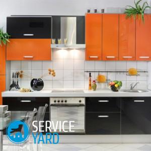
Red and orange
Red color is loved by energetic, strong and vibrant personalities. This color adds dynamism, fills with positive. But if you do not belong to this category of people - be careful. The abundance of red in the kitchen can make you irritable, tire your eyes very much and even increase your blood pressure. Then it is better to use not scarlet, but coral, raspberry, pomegranate and at the same time dilute it with the color of baked milk, caramel or ivory.
Possible options for how to choose the color of the kitchen with this shade:
- A combination of red and black looks modern. Black color dampens a little excitation, which gives red. However, the degree of illumination of the kitchen should be considered. If there is not enough light, then dark shades should be abstained.
- The orange color is very perky and fills with joy. It tones and energizes. It will be especially appropriate if the kitchen windows face west or north and the sun is forever lacking.
- Young couples often prefer a shade of mandarin in the kitchen.Very juicy will be a combination of it with the color of greenery. These are natural summer motifs. If you do not want such brightness, then give preference to shades of honey, pumpkin, apricot. In a company with white, cream or beige, they will look soft and comfortable.
Important! Red and orange colors can cause appetite, not for nothing that they are often found in the interiors of cafes and restaurants. Therefore, it is not recommended to use these shades for people who are struggling with excess weight and are on a diet.
Green, light green, olive
The green color has always been considered soothing, pleasant to perceive, so if you can not choose the color of the kitchen - look at the shades in this gamut, they will be quite appropriate. Especially if you have hard work, a green kitchen will help get rid of stress and relax at the end of the day.
 What does it harmonize with:
- The color of greens goes well with beige, brown, yellow. These are natural colors that will not be boring and will always be relevant.
- A shade of pistachios and lime - will cheer up and cheer up, especially in the company with yellow. In such a kitchen, white porcelain dishes and tubs with young greens on the windowsill would be appropriate.
- Older people prefer the color of olives, jade or pine needles, which combine well with white, gray and beige. It looks stylish and solid, especially in combination with metal “in gold” or “bronze”.
Yellow and gold
Yellow is usually associated with the sun, summer, dandelions and sunflowers:
- It will look especially advantageous in a kitchen in which there is a lack of sunlight. It nourishes vital energy and provides a good mood for households. You can use bright yellow in the facades of the headset, but then the tone of the walls should be different.
Important! Remember that bright yellow should be in moderation. Otherwise, the eyes will get tired, and the kitchen will subconsciously annoy.
- In a small kitchen, make a straw or sand color background. But in a large wall space you can make lime colors
- It blends yellow with blue and white.
- Gold is the color of luxury and affluence. If you want to make your kitchen chic, in the style of Baroque or Glamor, then you can not do without gold. Kitchen sets decorated with a golden patina look aristocratic. Acceptable gold decors, patterns on wallpaper, handles of lockers “in gold”.
Important! Try not to overdo it. The abundance of gold, for example, the entire kitchen set of this color, will look the other way around - cheaply.
Gold color is wonderfully combined with all warm shades, as well as beige, cream and white.
Purple and lilac
Violet is a rather unusual and rarely used color for the kitchen space. He is preferred by impudent, extraordinary, imperious people. It is cold, a little mystical, therefore suitable for spacious and well-lit rooms.
From the time of ancient Rome, purple was considered a symbol of wealth and aristocracy. But not everyone will like it.
Important! To many people, the violet color seems uncomfortable and depressing. Especially it is not recommended for people prone to depression, alcoholism. But if you nevertheless opted for it, then know that it goes well with black, golden, gray, pale blue and white.
Other options in this gamut:
- Lilac color is liked by creative, artistic and energetic people.
- Shades of indigo, blackberry and amethyst look more severe. They should not be in abundance, otherwise the room will seem gloomy.
- The colors of violets and lavender are very delicate and romantic. If you combine them with vanilla, cream or pistachio, then the kitchen will just breathe in the spring.
Brown, wenge, burgundy:
- Brown is the most classic color of furniture and has not gone out of fashion for many years. It is versatile and practical, combining with almost any color. This is the color of those people who love stability, nature, value life experience, because brown is a tree, earth, that is, that which gives a feeling of closeness with nature, peace.Brown can be both light and dark. Accordingly - for dark furniture, the background of the walls should be exactly the opposite, and vice versa.
- One of the options for brown is the color of wenge. Wenge is a valuable breed of African wood that has a beautiful color, from golden brown to black and chocolate with a beautiful texture and noticeable veins. If you are not limited in means, then you can install natural wood furniture in the kitchen. In the materials market, one can also find headsets that closely imitate the structure of wenge.
- Bordeaux is a noble color, refined and refined natures love it. He brings a touch of solemnity and chic to the kitchen, but at the same time, he can oppress and suppress if this color does not match the psychotype of your personality. This color harmoniously looks with beige, white, silver, milk, black, chocolate and ivory.
Important! Burgundy is a rather dark color, so it is acceptable either in spacious sunny kitchens, or requires good additional illumination.
Pink and gray:
- Pink is tender and romantic. It is more often chosen by young girls who want to realize their childhood dreams of a dollhouse. This is especially manifested when hot pink is combined with gently lilac or cream. To add romanticism to the curtains, bright dishes, vases with flowers, glossy surfaces, elegant patterns on the apron and wallpaper. If you don’t want “puppetry” in the interior, but the pink color is to your liking, then combine it with brown, turquoise or gray. It will look modern, but not childish. You can add chrome or silver details.
- Gray color - balanced, calm. He is liked by people who, in the first place, value stability, peace. But by itself, it will look boring, so gray or silver facades need to be diluted with a brighter background. Walls of pink, beige, even red color (if the kitchen does not have enough sun) will perfectly fit. But if the windows face south, then purple, blue or brown can be added to gray.
Important! Do not forget about the details - curtain, chandelier, tablecloth, dishes, should harmoniously fit into this color scheme.
Blue and blue:
- Blue - causes associations with a calm sky, a river. The interior in this color will give the soul a rest and a sense of cleanliness. It is also indispensable in small kitchens, as it will visually expand the space, create airiness, volume, especially if you combine blue with white, milky, ivory, add glass, glossy, mirror surfaces. If the kitchen is large enough and bright, then red, orange, yellow can be added to blue.
- Blue is a fairly cold color. It gives a feeling of coolness, serenity. But it’s important not to overdo it. Be sure to dilute it with light tones - yellow, orange, white, creamy. Otherwise, the room will seem gloomy, uncomfortable.
to contents ↑Important! Blue is contraindicated for those who suffer from depression, get tired at work. This color reduces appetite, it can even lower pressure. Be careful with him. Better if he will be present only in accents and details, do not make it dominant.
Stock footage
As you can see, to choose the color of the kitchen, you should consider many nuances. But if you do everything according to the rules, then no tone will annoy you, and staying in a room for many years will bring only a feeling of comfort and satisfaction.
- How to choose a vacuum cleaner taking into account the characteristics of the house and coatings?
- What to look for when choosing a water delivery
- How to quickly create comfort at home - tips for housewives
- How to choose the perfect TV - useful tips
- What to look for when choosing blinds
- What should be running shoes?
- What useful things can you buy in a hardware store
- Iphone 11 pro max review
- Than iPhone is better than Android smartphones
 (No ratings yet)